


Creating Cool Web Sites with HTML, XHTML and CSS (2010)- P8
lượt xem 9
download
 Download
Vui lòng tải xuống để xem tài liệu đầy đủ
Download
Vui lòng tải xuống để xem tài liệu đầy đủ
Tham khảo tài liệu 'creating cool web sites with html, xhtml and css (2010)- p8', công nghệ thông tin, kỹ thuật lập trình phục vụ nhu cầu học tập, nghiên cứu và làm việc hiệu quả
Bình luận(0) Đăng nhập để gửi bình luận!
Nội dung Text: Creating Cool Web Sites with HTML, XHTML and CSS (2010)- P8
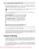
- 324 Creating Cool Web Sites with HTML, XHTML, and CSS A key underlying question to determine usability revolves around the target audience for your site and the purpose of your site. If you’re building a portal site to compete with Yahoo and MSN, you may want to include more information on the page than if you’re translating a three-page brochure into a humble Web site for a small-business client. If you’re building a Web site specifically to show off your coding skills, none of this note may apply. But read through this chapter anyway. The sanity you save may be your own! Amount of information presented The first guideline for usability is to always minimize the amount of information presented by showing only what’s necessary to the user. This rule explains why the AOL and MSN home pages are baffling when first visited, why it’s hard to figure out what’s going on at Yahoo!, and why Google, by contrast, is relaxing and easy to use. An example of a site with lots and lots of information that’s still thoughtfully organized to ensure that it’s not overloading the visitor is the U.S. Internal Revenue Service site. Figure 15-1 shows the current page. Figure 15-1: The Internal Revenue Service Web Site—clean, uncluttered, and easy to read. Please purchase PDF Split-Merge on www.verypdf.com to remove this watermark.
- Chapter 15: Thinking about Your Visitors and Your Site’s Usability 325 The site is clean, open, inviting, and has a small number of links off this page so that the user isn’t completely overwhelmed by the choices. Very nice! Compare this with the U.S. Social Security Administration Web site, as shown in Figure 15-2. Here you can see many more choices. The designer seems unable to differentiate between what I call the musts and the wants. The musts are those links that must be on the home page or, for that matter, on the specific page in question, whatever it is. The wants, on the other hand, are those links that would be helpful to have up-front, but are not critical. Remember, the guideline here is to minimize the amount of information presented. Less is more. Figure 15-2: The Social Security Administration Web Site—pretty overwhelming at first glance. To help achieve this minimization, keep these points in mind: • Use concise wording. • Use tables with column headings where appropriate. • Use familiar data formats. • Avoid unnecessary detail. • Use abbreviations appropriately. Please purchase PDF Split-Merge on www.verypdf.com to remove this watermark.
- 326 Creating Cool Web Sites with HTML, XHTML, and CSS To find out more about enhancing the usability of your Web site, I recommend an note excellent book on human-computer interaction: A Guide to Usability, edited by Jenny Preece (Addison-Wesley). Organize information on the page Another common mistake made on Web sites is the lack of any coherent organization. By organizing links and material, you significantly help the user find what he seeks. Although the Social Security page in Figure 15-2 has too much information, it is nonetheless a fine example of how grouping information can help make a Web page more usable. Notice the four key areas on the site entitled: Retirement and Medicare, Disability and SSI, Widows, widowers and other survivors, and Get help with your situation. What I also really like about this page is that everything is written in an active manner; it’s engaging, and it refers to me, the visitor. It doesn’t say “get help with a life situation,” it says “get help with your situation.” How can you ensure that your information is grouped appropriately? Here are some ideas: • Use color coding (I get back to color usage shortly). • Highlight elements using foreground or background colors. • Add graphical borders or other dividers to visually cluster elements. • Use different size text and different typefaces. The last idea is very important for good Web page design, in my opinion. I’m always surprised how infrequently sites use different size type effectively. Consider the IRS site back in Figure 15-1 for a moment. Notice how the word contents, is large and how the headlines are larger than the text underneath. Also notice the use of a graphical divider to organize information: the horizontal rule above and below the featured article titled, Undeliverable Refunds Looking for Taxpayers. By contrast, the Social Security site, by over loading its page with too much information, fails to take advantage of type sizes and ends up with links lost in a sea of words, almost all in blue. For reference purposes, the IRS Web page has 31 links on it, whereas the SSA Web note page has 79 links. Standardize the screen layout Screen layout can really make or break a site design, whether it’s complex or simple. The idea is that if you teach people to look in a certain place on your page for a specific type of information, make sure that it’s always in that place on all pages on the site. Consider Figure 15-3, the Firstgov.gov home page. Please purchase PDF Split-Merge on www.verypdf.com to remove this watermark.
- Chapter 15: Thinking about Your Visitors and Your Site’s Usability 327 Figure 15-3: The Firstgov.gov home page—complex, but with a method to the layout madness. This site is quite complex, but the content has a definite layout. There’s a navigational bar along the top, a set of self-identifying categorization tabs, and a high-level categorization column along the left side. Just as important, a search box is placed on the top-right. All well and good! The question is whether these basic organizational areas are carried through on other pages. To find out, I clicked Welcome from President Bush at the right end of the navigational bar. It revealed the page shown in Figure 15-4. This is an example of how not to structure the layout for the pages on your site. Instead of having a standardized screen layout and sticking to it throughout all the major areas of the site, Firstgov has created an environment that’s actively user unfriendly. As a user, you are forced to go back to the home page to get basic navigational elements (and notice that no Home link is visible in Figure 15-4 to take you back). You have to use the Back button on the browser. To be completely fair about it, the President’s welcome is actually part of the White House Web site, not part of Firstgov. Nonetheless, the problem remains: Visitors are note taught to expect certain information in certain places on the Firstgov site, but after only one click they are facing a completely different layout. Instead, I’d like to see the letter of introduction duplicated on the Firstgov site so that the site is visually consistent. Please purchase PDF Split-Merge on www.verypdf.com to remove this watermark.
- 328 Creating Cool Web Sites with HTML, XHTML, and CSS Figure 15-4: One click in, and the Firstgov site has changed its screen layout completely. Here are some ways that you can ensure standardization of information on your Web pages: • Important information that needs to catch the attention of the visitor should always be displayed in a prominent place on the screen. • Reports and reference information should be grouped together and shown on the less central areas of the screen. • Redundant information should only be displayed if it truly helps the user navigate the site. • Common elements, such as the site’s privacy policy, contact information, and copyright, should be displayed on the bottom of the page. If you opt to have a more complex site, it becomes critically important that you show infor mation in a completely consistent manner. So pay extra attention to this facet of usability. Presentation of text and graphics Although graphics are an important part of the Web, it’s still fundamentally a text-based medium. Consequently, think through very carefully how you want to present the text on your site. I talked about the importance of having larger and smaller text as a quick visual cue for visitors and about ensuring a consistent layout structure, but also consider some of the other important aspects of textual presentation: Please purchase PDF Split-Merge on www.verypdf.com to remove this watermark.
- Chapter 15: Thinking about Your Visitors and Your Site’s Usability 329 • Conventional uppercase and lowercase text (like the sentence in this book) can be read significantly faster than all uppercase text. • Right-justified text (also called align=”justify”) is more difficult to read than text with a ragged right margin. • Uppercase characters are most effective for drawing attention to items (and don’t forget small-caps in this regard). • Optimal spacing between lines is at least equal to the height of the characters them selves, and you can adjust this with line height in CSS. I almost always use at least a line-height of 1.25 to open up my design a little bit. A liberal use of CSS styles on your Web sites ensures that all your text is displayed tip attractively and in a manner that is as user-friendly as possible. In addition, the graphics you include on your Web site should not only convey useful informa tion or design elements, they should be maximally effective. Here are some things to consider when you design graphics for your site: • Context of the graphical elements: All visual metaphors and other graphical elements should be thematically consistent, including whether they are two- or three-dimensional and whether they are color or black and white. (A visual metaphor is a set of images or a picture that represents a certain function. The trashcan on your computer desktop, for example, is a visual metaphor for the file deletion function in the operating system.) To ensure a consistent graphical theme, a site that’s built around a mockup of the Windows user interface shouldn’t suddenly have buttons that look like they’re pulled from an auto dashboard or a children’s toy. • Task domain: Not all applications that can have graphics should have graphics. Although graphical representations of data are often preferred, some types of data are best pre sented as a text table, such as a month-at-a-glance calendar format. • Graphic form of the element: Choose either concrete representations of objects (photo graphs or finely detailed illustrations) or abstract representations (line art and symbols) to ensure consistency. • Extent to which elements can be discriminated in the overall design: Having a series of icons or graphical elements with similar appearance just serves to confuse the visitor. Another important issue is consistency, which I have woven through the different sections here. Whatever rules you choose to follow, do your best to ensure that your text, graphics, phrasing, and overall design are as logically consistent as possible. Choice and uses of color One final area to consider on page and site design is your use and application of color. Not only does color have significant cultural meaning that varies as you travel through the world, but you should also consider physiological issues. Bright red on bright blue and light grey on yellow, for example, are almost completely unreadable combinations on a computer screen. Please purchase PDF Split-Merge on www.verypdf.com to remove this watermark.
- 330 Creating Cool Web Sites with HTML, XHTML, and CSS Indeed, one aspect of color use to consider is whether your colors work for someone who is color blind: Most people with a color deficiency have a hard time differentiating between reds and greens. This may or may not influence your design depending on whether you anticipate that a significant percentage of your audience might have a color deficiency. You can find lots of interesting information on color blindness online. One good on the place to start is the National Institutes of Health’s usability.gov Web site. For spe web cific information, jump straight to http://usability.gov/web_508/tut-c.html. Nonetheless, color can and does convey meaning on a Web site, and it’s hard to imagine a situation where you wouldn’t use any sort of colors on your site, except perhaps if you are a photographer seeking a stark, black-and-white design. But that’s another story! In terms of good usage of color, I try to take to heart the usability.gov suggestion that color be used as a bonus for your design, rather than as a critical element of everything functioning well. Here are some guidelines for using color: • Use color where it adds value or conveys information. Compare the usage of color at Yahoo! with the usage of color at MSN or AOL to see what I mean. • Use logical colors for the meaning you seek: If you’re creating a site about backpacking, for example, use outdoor colors, greens and browns. A techno or industrial site might have a lot of black, by contrast. • Be sparing with inverse color choices: white on black is much more difficult to read than black on white, for example. • Try to pick a color palette and stick with it. • Be conscious of the cultural meaning of colors for your main audience. In Western cul ture, for example, black represents death, white represents purity and innocence, yellow represents warnings, and red represents danger. Given that, highlighting information in red because it stands out, is a usability error. Having said all that, don’t be afraid to experiment! Considering the color usage guidelines is important, but some sites look delightful with yellow text on dark blue, with green edges. In addition to issues of color blindness, you may need to address other possible handicaps. These include screen readers for blind visitors (that is, how effective is note your Web site if no graphics are loaded?), voice control or mouseless navigation (do you force users to navigate through pull-down menus exclusively?), and more. These are additional reasons to ensure that you always include alt tags with your images and offer non-graphical navigational alternatives. Navigating Your Web Site In addition to design and usability, it’s worth thinking about how visitors navigate through your site. This area is one of the most difficult parts of site design, because you have to cre ate an overarching hierarchy of information for your site when it might not have a coherent vision or organization in the first place! Please purchase PDF Split-Merge on www.verypdf.com to remove this watermark.
- Chapter 15: Thinking about Your Visitors and Your Site’s Usability 331 For my personal site, I have over 900 pages online, and I’ve really tried to categorize them according to some basic concepts. Consequently, I have the four major sections of Teaching, Speaking, Writing, and Consulting. You can see them as the main navigational elements in Figure 15-5. Figure 15-5: Navigational elements of my Intuitive Systems Web site. Notice in Figure 15-5 that I’m also trying to stick with the usability guidelines discussed throughout. The site has an open design, subtle use of colors and graphical elements, fewer rather than more links, and the introduction of what proves to be a consistent information lay out. Also notice that this first page has links to other areas (such as my digital photography portfolio) as part of the main prose, rather than as another navigational link. A downside is that no single place has all links to all areas immediately obvious; but the upside is that the site design is much less cluttered and less overwhelming than, say, the SSA site shown earlier. Tracking navigation One trick that many sites employ, and which can be particularly helpful for users, is to have a visual indication of where in the site hierarchy the particular page is located. Flip back to Figure 15-4 and notice how the White House site does a nice job of providing this site hierar chy information. If you look just under The White House logo, you can see that this page can be found in their hierarchy at Home ➪ News & Policies ➪ March 2002. Just as important, each of those phrases is clickable, so you can jump directly to the top-level News & Policies area, for example, by clicking the phrase on the page. Please purchase PDF Split-Merge on www.verypdf.com to remove this watermark.
- 332 Creating Cool Web Sites with HTML, XHTML, and CSS Sites such as Yahoo! and the Open Directory Project do a wonderful job of this type of hierar chical cookie crumb trail navigational element (see the following section for more information about cookies). It’s well worth studying if you’re building a site that’s going to have any sort of deep organization. You can also leave a relatively subtle hierarchical trail in the title of your pages, where each level is either appended or prepended to the standard title. It might look like this as you navi gate through a site: Norwood/Quince EcoPass Information Region Map :: Norwood/Quince EcoPass Information Norwood Ave :: Region Map :: Norwood/Quince EcoPass Information This technique has the advantage that it helps create useful and informative bookmarks but still ensures that the key words are included in the title. See Chapter 17 to find out more about bookmarks and how to ensure that potential x-ref visitors can find your site. Site search engines Another way to help people navigate your site is to include a search engine of some sort. This can be easier than you think. Many Web-hosting companies now include one or more common search engines that you can literally plug into your design and use after the engine has indexed your pages. A popular search engine goes by the odd-looking name of ht://Dig. You can learn tip more about it at http://www.htdig.org/. Another approach to having a search engine is to use an existing search engine and constrain its results to just your site. Chapter 12 has an extensive example of how you can use Google to add a search capability to your own site that lets visitors choose between searching just your site and searching the entire Web. Site maps A third option for helping people navigate the information on your site is to have a separate page called a site map. You’ve doubtless seen these on very large sites with hundreds of dif ferent areas. But site maps can be useful for smaller sites too, especially if you’re worried that visitors won’t necessarily figure out how you’ve organized your information, and you don’t want to include a search engine. Please purchase PDF Split-Merge on www.verypdf.com to remove this watermark.
- Chapter 15: Thinking about Your Visitors and Your Site’s Usability 333 Your site map can be as simple as a single-page indented list or as fancy as you desire, but the key idea is to include a Site Map link somewhere on every page on your site. Wherever people end up, they can always pop over to the map and figure out the path to what they’re trying to reach. As an added bonus, Google and other algorithmic search ranking systems tend to like sites with site maps, so it may also help with your site ranking. x-ref For more information on improving your site ranking, flip to Chapter 17. Using Cookies to Remember User Information If your site offers user customization, user accounts, or other configuration elements that can change based on whether visitors have been there before or not, a very popular solution is to use cookies. Cookies are small packets of persistent data stored on the visitor’s computer, not on the server. The word persistent is the key here. With cookies you can quit your browser, reboot your computer, and the data is still present and sent back to the site next time you visit. That’s how sites like Yahoo! have Welcome back messages instead of a login area. Your Web browser has a store of hundreds of cookies from different sites, I bet, and you might not even be aware of them. It’s a rare site nowadays that doesn’t feed some sort of persistent information to you when you’re browsing: You’ll find that some areas of my intuitive.com site do too. Why use cookies? Because if you’re asking visitors for information, the more your site can “remember” from the last visit, the easier and more usable your site becomes. In particular, with sites that require a log in, it’s very nice to offer the option of staying logged in on a par ticular computer: That’s all done with cookies. If you’re running MSIE6, it’s not very easy to see your cookies. I recommend you download a simple little application called Karen’s Cookie Viewer, written by expert Windows programmer Karen Kenworthy. on the web Karen’s Web site is at http://www.karenware.com/ Final Thoughts about Usability In terms of usability, just remember one key point: Building a usable site is a process not a goal, per se. Listen to your visitors, invite input and feedback, and be focused on the goal of a site that’s attrac tive and usable, not the goal of its being ultimately cool or a tour de force of graphical interactivity. Rebuild pages, reorganize information, and rethink presentation issues based on what your visitors tell you. Please purchase PDF Split-Merge on www.verypdf.com to remove this watermark.
- 334 Creating Cool Web Sites with HTML, XHTML, and CSS The application is free and makes it quite easy for you to browse all the cookies your Web browser has been dutifully saving for you. Figure 15-6 shows a list of my cookies and the specific details of one of the two cookies I am storing from Tim Carter’s excellent Ask The Builder Web site. Figure 15-6: Displaying cookie information. Summary This chapter gave you a chance to step back from the nuts and bolts of Web page and Web site design and look at the user experience. You looked at how people are likely to perceive your Web site when they visit and what things you can do to make your site easier to under stand and easier to navigate. Although the rules may seem obvious, many Web sites violate one or more of them regularly. These violations can make a site less enjoyable, less effective, and less useful than it might otherwise be. The next chapter looks at the other end of Web design: how to ensure that your CSS and HTML are perfectly written and valid. Please purchase PDF Split-Merge on www.verypdf.com to remove this watermark.
- Validating chapter Your Pages and Style Sheets In This Chapter 16 Validating HTML, XHTML, and CSS Creating Web pages for wireless devices Introducing WML and WAP S o far, you’ve learned how to work with various HTML tags, how to fine-tune presentation using CSS, and that Web browsers are quite forgiving about the occasional incorrect tag usage. If you add a wrong attribute, misspell a tag, or forget to close a list element, the browser does its best to fix your error without complaining. However, don’t conclude that you can lapse into sloppy coding habits! Validating HTML and XHTML Web Pages Because modern Web browsers are so complex, it’s important to ensure that your HTML is valid and correct. Fortunately, some terrific online tools help you produce clean, proper HTML. Notable among these is the World Wide Web Consortium’s (W3C) HTML Validator Tool, which you can find at http://validator.w3.org/. I particularly like this validator because W3C is the group that manages and blesses the different HTML, XHTML, and CSS standards, so its validator should be the most accurate of the options available. Unfortunately, using a validator isn’t as easy as just pointing it to your Web page and clicking the Validate button. Try that and you promptly find the validation system complaining that it can’t figure out what kind of HTML to check against, and what character set your page uses. (For more information about character sets, see the section “Specifying a character set” later in this chapter.) Please purchase PDF Split-Merge on www.verypdf.com to remove this watermark.
- 336 Creating Cool Web Sites with HTML, XHTML, and CSS To use the validator, you need to add a line called DOCTYPE to the beginning of your HTML files, as shown in the following example: This particular DOCTYPE declares the document to be HTML 4.01 transitional, which means that the validator requires that you have used the most recent HTML tags and format, but it also accepts older, correct, HTML. If you want to be forced to use only HTML 4.01 tags on your pages and not let any old or obsolete (referred to as deprecated) tags creep in, you should use Strict instead of Transitional. What are the differences among all these versions of HTML? Really, they come down to nuances and the changes caused by evolution of the HTML language. If note you want to learn about the specific differences among versions of HTML, your best bet is to read some of the excellent reference material on the W3C Web site, found at http://www.w3.org/. If you use HTML 4.01 (as I do in this book), additional formatting is necessary for your code to be valid XHTML. Three other DOCTYPE options exist. The following example calls for HTML 3.2: When you use the HTML 3.2 Final designation, the validator flags any HTML 4.01 tags as errors in the source. If you’ve been working along with me and using the code I’m demon strating, you’re far beyond the HTML 3.2 specification, anyway. The next example calls for strict HTML 4.01: With the HTML 4.01 designation, earlier tags you may have used including and similar, are not acceptable and are flagged as errors. If you use this option, it’s quite difficult, in my experience, to have your page reported as fully compliant. This last example shows the DOCTYPE for XHTML 1.0 Transitional: I explore this designation later in this chapter. Notice that the DOCTYPE tag forces you to choose between HTML and XHTML. Please purchase PDF Split-Merge on www.verypdf.com to remove this watermark.
- Chapter 16: Validating Your Pages and Style Sheets 337 Specifying a character set In addition to the DOCTYPE, validators want to know what character set you’re using. Because my page uses plain ASCII (alphanumeric characters, the set of characters you use for e-mail and other plain applications)—no special characters for foreign languages or special symbols— I simply add the following line to my HTML code: Character entities themselves are always plain ASCII, regardless of what symbol they produce when interpreted. If you want your Web page to contain various Spanish or German characters, your x-ref best approach is to use the character entities explained in Chapter 5, and stick with plain ASCII. It’s the most portable solution. Validating an HTML page You can feed your HTML to the W3C validator in two different ways. Open the Validation Service page at http://validator.w3.org and use one of these methods: • In the Address box, specify the URI of the page you want to validate and click the Validate URI button. • In the Local File box, type the path to your local file (or use the Browse button to find it on your system) and then click the Validate File button. Now see what happens when you try validating this sample page: Validation Test There are some errors in this file Can you spot all the mistakes in this simple HTML file? Figure 16-1 shows this page’s URI—http://www.intuitive.com/coolsites/examples/ ch16-1.html—entered into the Address box on the W3C validator page. Please purchase PDF Split-Merge on www.verypdf.com to remove this watermark.
- 338 Creating Cool Web Sites with HTML, XHTML, and CSS Copyright © 1994-2003, World Wide Web Consortium Figure 16-1: Asking the W3C validator to check a test page for HTML compliance. Figure 16-2 shows the result of the validation process on this test file after the Validate URI button is clicked. The actual errors listed for this very short HTML page are as follows: Line 4, column 5: document type does not allow element “HTML” here Line 7, column 11: there is no attribute “COLOR” Line 9, column 6: end tag for “DIV” omitted, but its declaration does not permit this. Line 7, column 0: start tag was here. Line 10, column 8: “HEAD” not finished but document ended
- Chapter 16: Validating Your Pages and Style Sheets 339 Copyright © 1994-2003, World Wide Web Consortium Figure 16-2: The sample page is not valid HTML. If you’re like me, you look at all this and say, “Huh?” It’s critical to remember that validators do the best job they can, but if something is not configured correctly, it can trigger an error that then messes up all the subsequent messages from the validators. In this instance, a closer look at the HTML file reveals that the basic problem is that tags are out of order, and I left out an opening tag and a closing tag. If you make the necessary revisions (shown in bold in the following code), you get this new version of the HTML snippet: Validation Test There are some errors in this file Continued Please purchase PDF Split-Merge on www.verypdf.com to remove this watermark.
- 340 Creating Cool Web Sites with HTML, XHTML, and CSS Continued Can you spot all the mistakes in this simple HTML file? Does this validate as correct HTML 4.01 transitional? To find out, I applied these changes to the HTML file and created ch16-3.html, which I then specified as a URI to the validator. The result: yes! See Figure 16-3 for the good news. Copyright © 1994-2003, World Wide Web Consortium Figure 16-3: HTML validates as correct HTML 4.01 transitional code. Notice that after the page validates, the site offers you the capability to slap a happy “HTML 4.01” graphic (these are called medallions in the online marketing biz) on your page to show that it has been validated. W3C even offers this code to help you add this graphic: Please purchase PDF Split-Merge on www.verypdf.com to remove this watermark.
- Chapter 16: Validating Your Pages and Style Sheets 341 Notice that although this snippet is valid HTML, it is not valid XHTML. Also, don’t have a lapse in judgment: Include the medallion only on pages that do validate. You don’t want to look foolish if a visitor decides to test your page and runs into errors. Would someone really test your page? Probably not, unless you proudly advertise note that it’s completely HTML compliant with the graphical icon. Then analyzing and revalidating the page is simply a matter of clicking on the medallion icon. Validating XHTML Pages Although HTML 4.01 is the latest version of HTML, the introduction and popularity of XML, the eXtensible Markup Language, has caused Web developers to move toward a hybrid markup language called XHTML. In a nutshell, XHTML offers all the capabilities and format of a regu lar HTML document, but forces a slightly more formal tag usage. The entire set of XHTML rules can be easily summarized, and I discussed them in Chapter 2. But here’s the full set of XHTML rules to refresh your memory: • Documents must be well-formed and exhibit proper nesting (all opened tags must be closed, and in the correct order). • Elements and attributes must be in lowercase only. • For non-empty elements, end tags are required (esp. the tag). • Attribute values must always be quoted. • Attributes cannot be minimized (for example, noshade should be noshade=”noshade”). • Empty elements must otherwise end with a /> sequence. • All img tags must have an alt=”” attribute. To explore the differences between HTML and XHTML validation, take the code snippet shown earlier and translate it into proper XHTML; then see if it validates. Here’s my first attempt at this translation: Validation Test There are some errors in this file Can you spot all the mistakes in this simple HTML file? Continued Please purchase PDF Split-Merge on www.verypdf.com to remove this watermark.
- 342 Creating Cool Web Sites with HTML, XHTML, and CSS Continued Did you notice that I’m using a different DOCTYPE, one that specifies transitional XHTML instead of HTML 4.01? To see if this code is valid and clean XHTML, simply ask the W3C validator to test it by going to the same page as before—http://validator.w3.org/—and feeding in the URL http://www.intuitive.com/coolsites/examples/ch16-04.html. The results are not good. The validator reports that the page is not valid XHTML 1.0 transi tional and lists the following errors: Line 6, column 71: end tag for “meta” omitted, but OMITTAG NO was specified ...nt-Type” content=”text/html;charset=us-ascii”> Line 6, column 2: start tag was here Line 19, column 54: end tag for “img” omitted, but OMITTAG NO was specified alt=”Valid HTML 4.01!” height=”31” width=”88”> Line 17, column 50: start tag was here ending. The tag has exactly the same problem: Because it’s not a paired tag, it must end with /> not just >. Here’s the HTML source again, with two small tweaks to fix these problems: Validation Test There are some errors in this file Please purchase PDF Split-Merge on www.verypdf.com to remove this watermark.
- Chapter 16: Validating Your Pages and Style Sheets 343 Can you spot all the mistakes in this simple HTML file? note The URI for the corrected XHTML is http://www.intuitive.com/coolsites/ examples/ch16-4b.html. Figure 16-4 shows the valid result after I make these changes. Copyright © 1994-2003, World Wide Web Consortium Figure 16-4: A few simple changes result in valid XHTML 1.0 transitional code. Please purchase PDF Split-Merge on www.verypdf.com to remove this watermark.
CÓ THỂ BẠN MUỐN DOWNLOAD
-

Creating Cool Web Sites with HTML, XHTML, and CSS- P1
 50 p |
  211
|
211
|  58
58
-

Creating Cool Web Sites with HTML, XHTML, and CSS- P2
50 p | 144
| 29
-

Creating Cool Web Sites with HTML, XHTML, and CSS- P3
50 p | 129
| 29
-

Creating Cool Web Sites with HTML, XHTML, and CSS- P4
50 p | 125
| 28
-

Creating Cool Web Sites with HTML, XHTML, and CSS- P9
32 p | 147
| 24
-

Creating Cool Web Sites with HTML, XHTML, and CSS- P10
4 p | 124
| 24
-

Creating Cool Web Sites with HTML, XHTML, and CSS- P6
50 p | 112
| 22
-

Creating Cool Web Sites with HTML, XHTML, and CSS- P5
50 p | 112
| 21
-

Creating Cool Web Sites with HTML, XHTML, and CSS- P7
50 p | 186
| 20
-

Creating Cool Web Sites with HTML, XHTML, and CSS- P8
50 p | 201
| 19
-

Creating Cool Web Sites with HTML, XHTML and CSS (2010)- P3
50 p | 111
| 16
-

Creating Cool Web Sites with HTML, XHTML and CSS (2010)- P2
50 p | 94
| 12
-
Creating Cool Web Sites with HTML, XHTML and CSS (2010)- P7
50 p | 140
| 10
-
Creating Cool Web Sites with HTML, XHTML and CSS (2010)- P4
50 p | 98
| 9
-
Creating Cool Web Sites with HTML, XHTML and CSS (2010)- P5
50 p | 70
| 9
-
Creating Cool Web Sites with HTML, XHTML and CSS (2010)- P9
32 p | 99
| 9
-

Creating Cool Web Sites with HTML, XHTML and CSS (2010)- P6
50 p | 78
| 8


Chịu trách nhiệm nội dung:
Nguyễn Công Hà - Giám đốc Công ty TNHH TÀI LIỆU TRỰC TUYẾN VI NA
LIÊN HỆ
Địa chỉ: P402, 54A Nơ Trang Long, Phường 14, Q.Bình Thạnh, TP.HCM
Hotline: 093 303 0098
Email: support@tailieu.vn
Giấy phép Mạng Xã Hội số: 670/GP-BTTTT cấp ngày 30/11/2015 Copyright © 2022-2032 TaiLieu.VN. All rights reserved.

